Coverage maps need not be confusing
The good, the bad and the ugly of mapping in telecommunications
Coverage maps need not be confusing
The good, the bad and the ugly of mapping in telecommunications
In late 2014 the United Kingdom government said it would like mobile operators to share coverage to cut out so-called “notspots”, or areas where there is no signal. Naturally, there has been some resistance to imposed domestic roaming as coverage is traditionally a major differentiator between mobile operators. Underpinning some of the arguments in support of national roaming is a number of cellular coverage maps. Sadly, many of these are cartographically quite poor and are limited in carrying their message. This is true of many maps used to depict coverage, whether wired or wireless services. However, coverage maps need not be confusing.

Source: theguardian.com
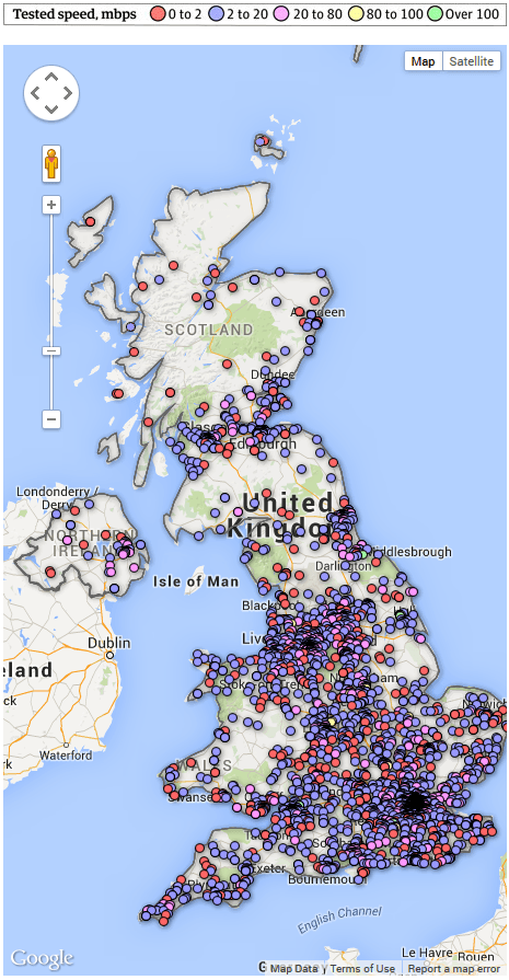
This map from the Guardian (a UK newspaper) website represents wired broadband availability and performance, based on reports submitted by the public. This map illustrates two important points:
- Web mapping services, such as this one which is based on Google Maps, provide a straightforward mechanism to put symbols or “pins” on the map. However, when these become numerous, there are issues of legibility since the points in dense areas appear on top of each other at national level. These “chicken pox” maps are sadly quite common in web mapping as it is easy to geocode and put markers on a map.
- Unless surveys also encourage people to submit that they have no broadband coverage (one assumes they would have to file such a report from the office, local library, coffee shop, etc.) then such maps cannot be an accurate records of where there is really no coverage. The map therefore shows where there is coverage, but cannot be used to infer where there is not.
Better maps, better understanding
Coverage maps are useful and powerful modes of communication, but this must come with a degree of responsibility. Some key factors to consider are:
- Is the coverage comparable from network to network? Were the same signal levels, or broadband speeds, used to make a fair side-by-side comparison?
- What is the vintage of the coverage data? Is old coverage being shown next to new?
- Has any processing of data for aesthetic purposes significantly changed the coverage?
- Is the coverage clear with the important elements unhindered with superfluous detail?
- Are the colours used carefully chosen and friendly to those 1 in 12 men, plus some ladies too, who have a colour vision deficiency (CVD) aka “colour blind”?


